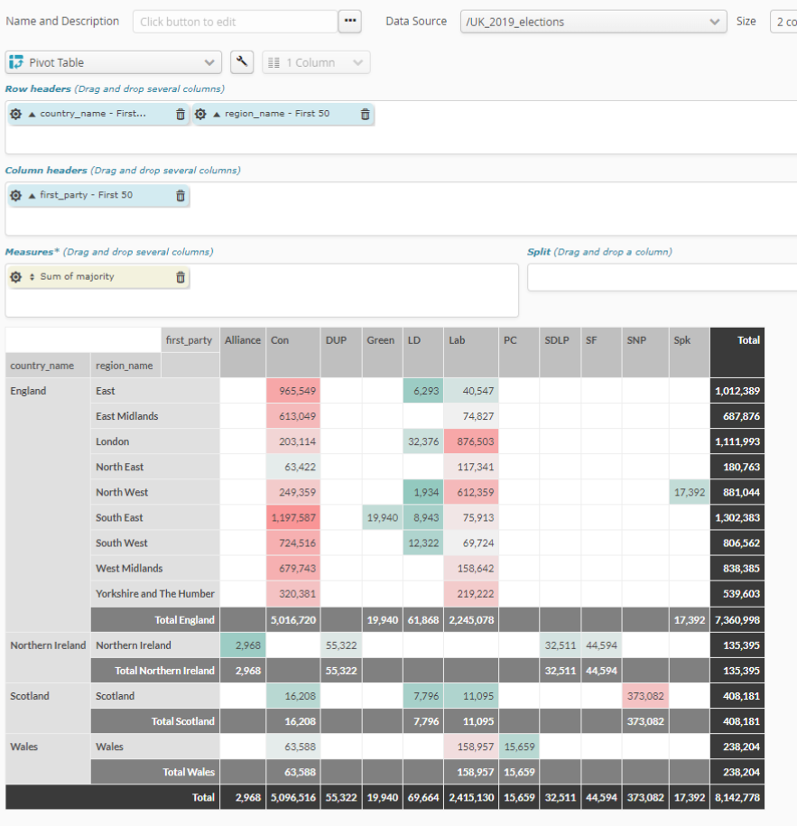
6.3.10. Pivot table
A pivot table is a chart that enables you to produce pivot charts quickly and dynamically. It works in the same way as an aggregation node, but performs better because there is no limit to the number of columns or rows that can be grouped together or to the number of fields you can aggregate.
As with tables, you can Filter data, sort columns, and download the table in Excel format independently..

To group data together in a few columns, drag the fields concerned to Column headers. As with the table, fields are added one after another and can be re-ordered using drag and drop.
To group data together in a few rows, drag the fields concerned in the same way to Row headers.
Anything the table measures will be taken to Measurements, which can contain an unlimited number of fields, allowing you to display several different fields side by side.
Use the sprocket for the field concerned to change its organization into categories. This may, for example, let you change:
the interval size of numeric values.
the organization mode for date-type values, by e.g. month, year, century, etc.
the number of categories represented (10, 20, 50, etc., or all of them).
if there are too many categories to be represented, whether an “Other” category should be included.
Pour les champs numériques utilisés pour la mesure, la roue dentée du champ de la mesure permet de paramétrer le mode de mesure. Ceci permet de choisir, à partir de ce champ numérique, ce qu’il faut calculer. Les calculs disponibles sont :
number of items (Number)
item average (Average)
sum of items (Sum)
smallest item (Minimum)
biggest item (Maximum)
To change cell colour, click the wrench shown in the chart. This is an interface to the following parameters:
Red/black |
Lets you check that negative values are shown in red (when viewing financial data, for example) |
Column sub-totals |
Active display/no display of column sub-totals |
Row sub-totals |
Active display/no display of row sub-totals |
Column totals |
Active display/no display of column totals |
Row totals |
Active display/no display of row totals |
Colors |
as described below, this lets to check how cell values are colored (if they are colored). |
There are several coloring options:
- No color
No background color.
- Linear gradient
The color will be applied along a range of shades, from the lowest to the highest value. The value that is exactly between the minimum and maximum values will be the color in the middle of the gradient.
- Gradient percentile
The color will be applied along a range of shades that will take account of the distribution of the values concerned, from the lowest to the highest value. The precisely median value (i.e the value with as many values above it as below it) will therefore be the color in the middle of the gradient.