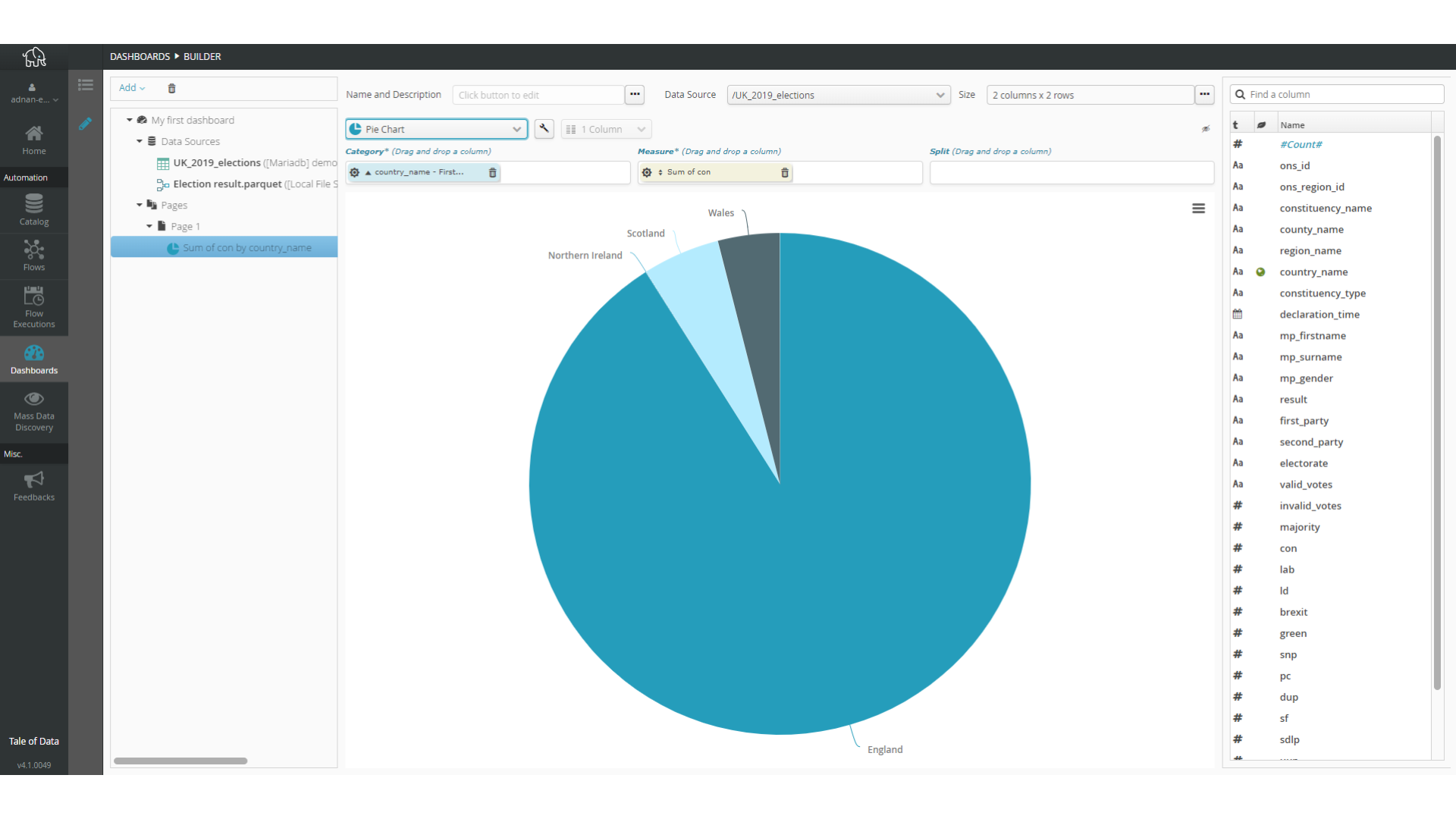
6.3.8. Sector
The sector chart is a standard pie chart with two dimensions:
category, which lets you group together data that will be in the same sector.
measurement, which will determine the angle proportion for every sector associated with each category.
To change sector color mode, Simply use the “wrench” setting key for overall options of the chart..
Use the sprocket for the field concerned to change its organization into categories. This may, for example, let you change:
the interval size of numeric values.
the organization mode for date-type values, by e.g. month, year, century, etc.
the number of categories represented (10, 20, 50, etc., or all of them).
if there are too many categories to be represented, whether an “Other” category should be included.
Pour les champs numériques utilisés pour la mesure, la roue dentée du champ de la mesure permet de paramétrer le mode de mesure. Ceci permet de choisir, à partir de ce champ numérique, ce qu’il faut calculer. Les calculs disponibles sont :
number of items (Number)
item average (Average)
sum of items (Sum)
smallest item (Minimum)
biggest item (Maximum)
Note
The pie chart automatically displays a percentage based on the value.