6.3.11. Time series
Time series charts display data by date field.
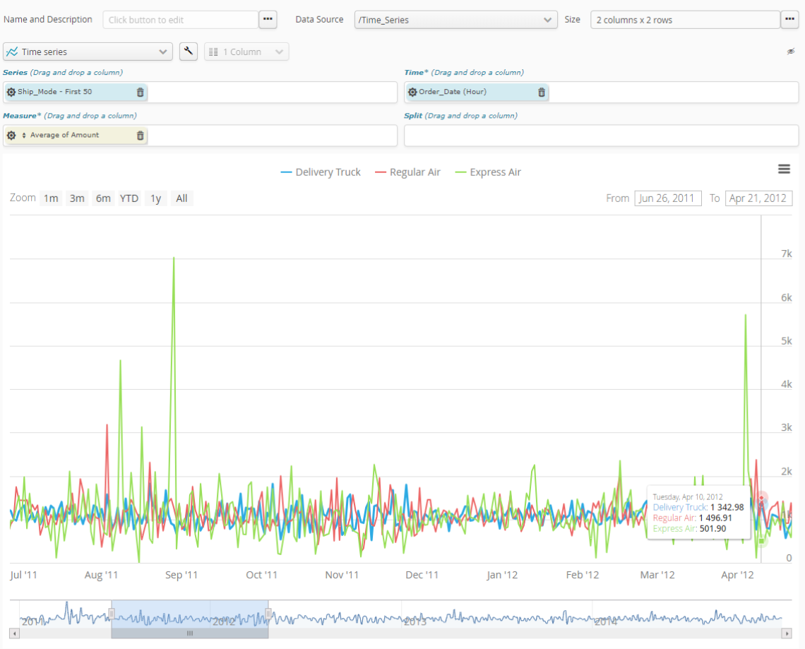
To change series color, Simply use the “wrench” setting key for overall options of the chart..
Use the sprocket for the field concerned to change its organization into categories. This may, for example, let you change:
the interval size of numeric values.
the organization mode for date-type values, by e.g. month, year, century, etc.
the number of categories represented (10, 20, 50, etc., or all of them).
if there are too many categories to be represented, whether an “Other” category should be included.
In the case of the numeric fields used in the measurement, the sprocket for the measurement field will let you configure measurement mode. This will let you select what needs to be calculated, based on that numeric field. Available calculations are:
number of items (Number)
item average (Average)
sum of items (Sum)
smallest item (Minimum)
biggest item (Maximum)
Note
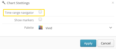
There are two possible display modes:
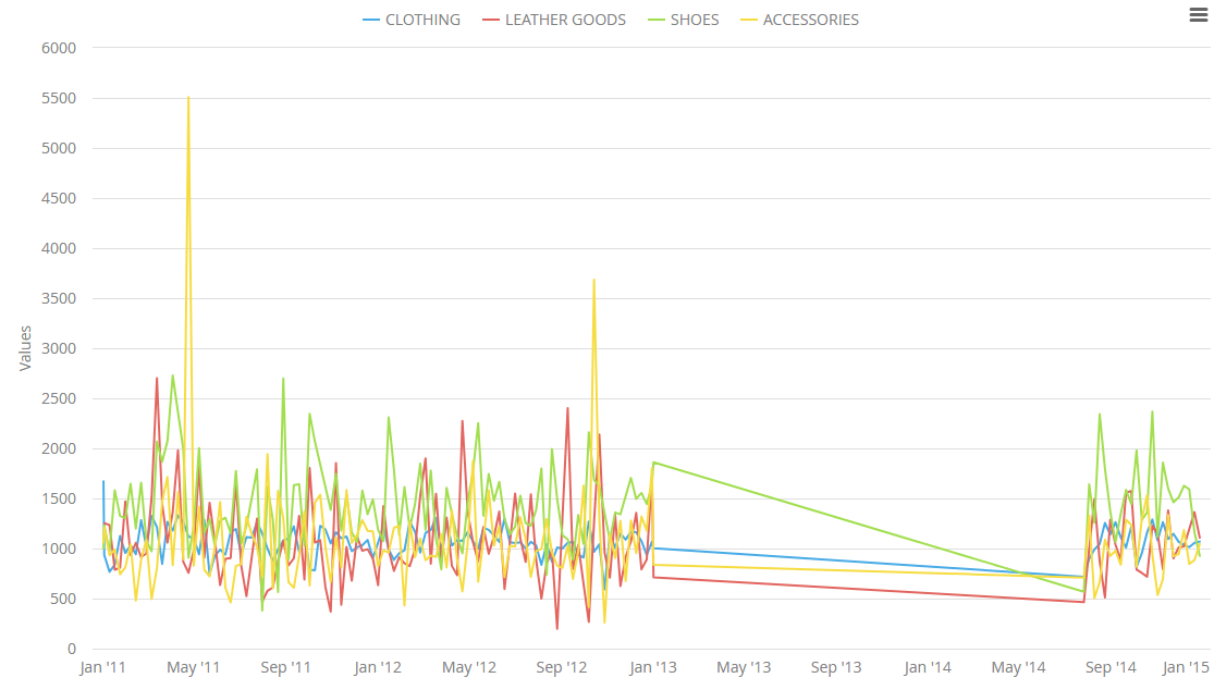
With the time range navigator disabled, missing data over time will appear, and the scale contains the entire time range of the dataset without simplification.
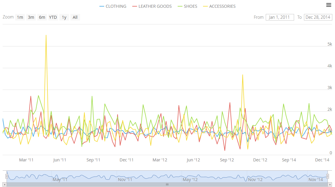
With the time range navigator enabled, the data is displayed consecutively; if there are missing periods (for which no data is available), they are skipped. The time range navigator then appears at the bottom of the chart and can be adjusted to explore the data locally.