6.1. Introduction
6.1.1. Data Visualization
Dashboards, from the consumer/user side
Discover how to use Tale of Data dashboards.
Dashboards, from the creator’s perspective
Learn how to create your dashboards.
Data Visualization is essential to careful data use. It turns raw data into understandable visual information for easier essential insights. As visualization tools, dashboards play a crucial role in making data intelligible.
Tale of Data is an integrated solution that creates a synergy between data processing and data visualization. This integrated approach ensures that the data feeding into your dashboards has been adjusted and validated and is ready for correct interpretation.
6.1.2. Visual data exploration
Dashboards are not just esthetically pleasing tools. They are also powerful catalysts that when correctly used can revolutionize the way decisions are taken. Combining data processing with data visualization ensures that visual representations are both accurate and informative.
Tale of Data turns the visual exploration of data into an enriched experience that lets you detect and understand trends, performance and anomalies fast. Visual exploration is backed up by the ability Tale of Data gives you to preview data from the quality assurance phase, making it easier to detect and correct outliers and malformed data.
6.1.3. Dashboard Reader Licence
Collaboration and the sharing of insights are key to creating a data-driven culture within your organization.
Tale of Data offers an extremely affordable “dashboard reader licence that gives access only to Tale of Data dashboards, making it easy to share them with a wide range of users.
Ease of sharing facilitates not only collaboration but also transparency and access to information, enabling each team member to access the insights generated and therefore make an informed contribution to collective decision-making.
6.2. Creating and adjusting dashboards
6.2.1. Dashboards and data sources
6.2.1.2. Adding data source to your dashboard
Dashboards are fed by data. In Tale of Data this means data sources, i.e. tables in the catalog. Data sources can be selected in two ways.
Data source taken directly from the catalogue
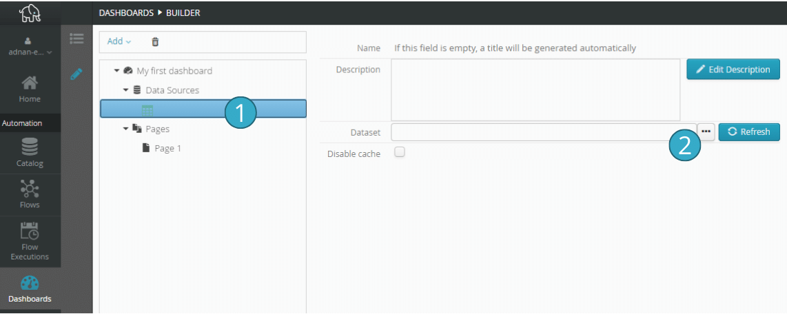
Click first a blank table in the tree on the left [1 and then the button marked “…” on the right  .
.
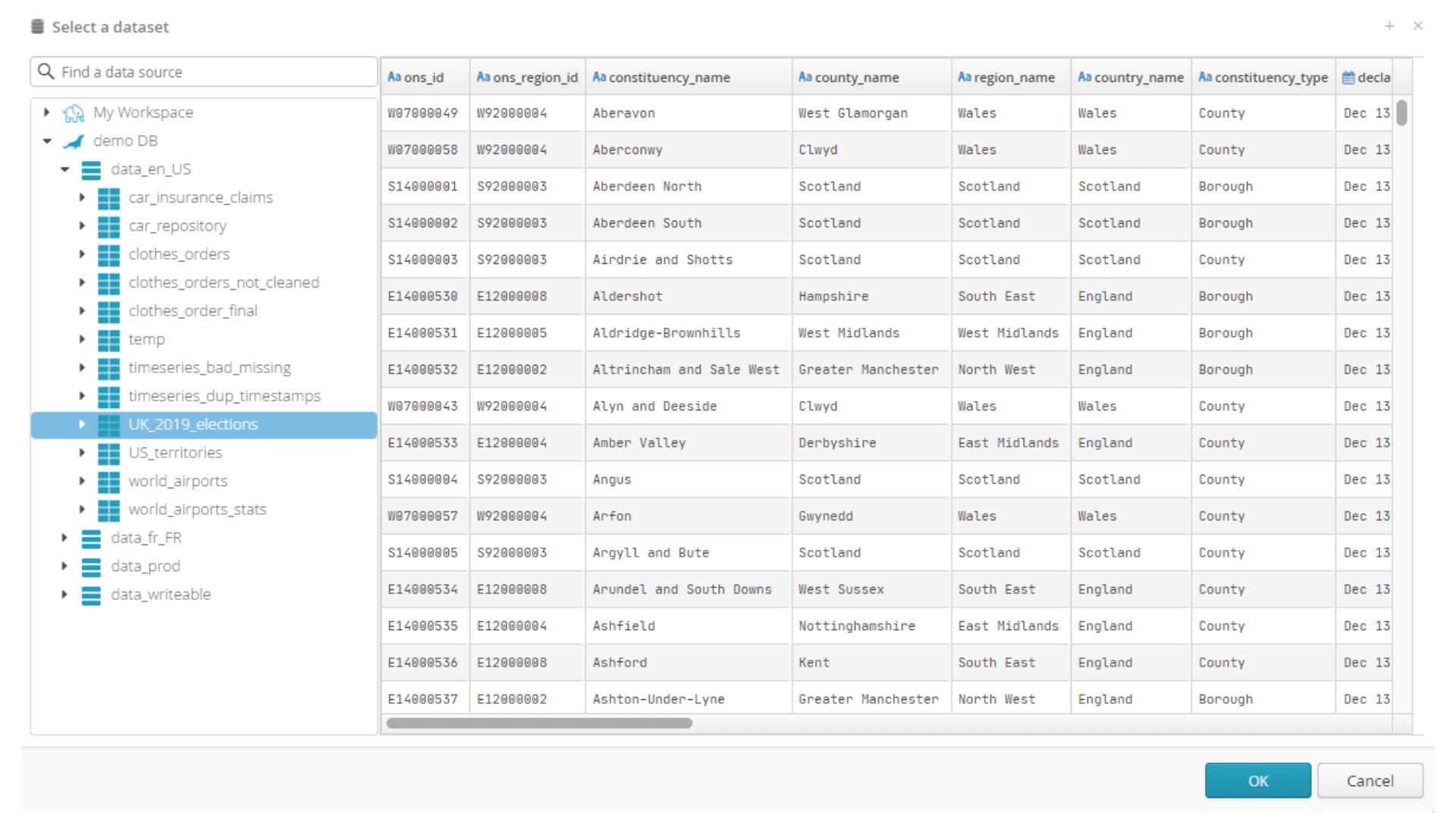
In the window that opens, find the catalog table you want in the tree on the left and then click on the table to select and view it.
The dashboard workspace will appear with the data source you have just created. You now need to create charts to view the data.
6.2.1.3. Source of data produced by a flow
Alternatively, you can use a flow sink as the data source for your dashboard. You can use any type of sink but if it is in your workspace, we recommend that for the best performance you use a Parquet format.
It all starts with a flow, which will create a sink that can be displayed on a dashboard.
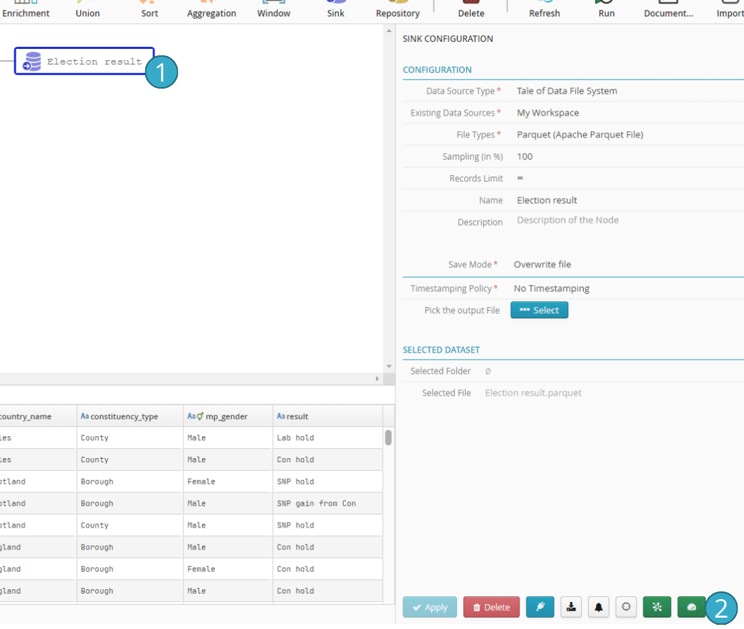
Note: the flow must have been run at least once. Data needs to exist before it can be used as a source on a dashboard.
The sink  is the data you want to include in a dashboard. Select it and then click the button
  to add it to a dashboard.
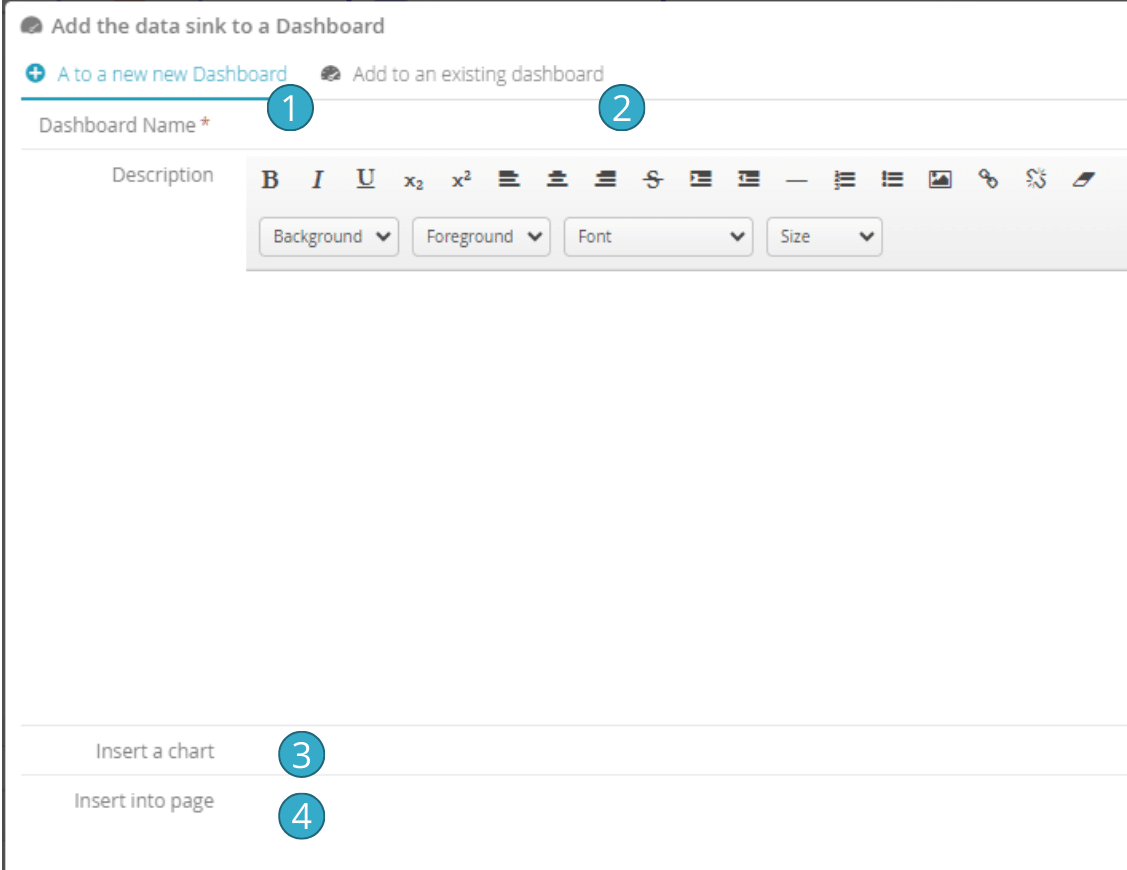
The window that opens will let you create a new table that is fed from this source  . Click the other tab
  to add the source to an existing dashboard.
The  and
and  fields are optional and let you specify a page, and if relevant a chart, to be created on the dashboard.
6.2.1.4. Differences between catalog and flow data sources
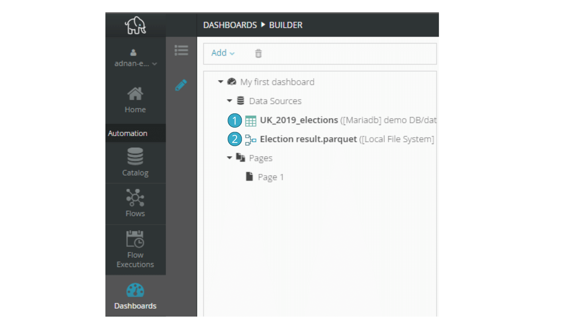
Catalog data sources are represented by a table icon  .
.
Flow data sources are instead represented by a flowchart icon  .
.
Tale of Data behaves slightly differently with the two types of source:
Selecting  or
or  will depend on what you require. Option
  carries significant advantages for following data lineage. Option
  is mainly useful if the data has been written externally and has no preparatory processing by Tale of Data before appearing on dashboards.
6.2.2. Adding pages and charts
Tables contain pages. Pages contain charts. A first page (“Page 1”) is automatically added to any new dashboard  .
.
To add a chart to the first page, select it  and then right-click. Select “Add a chart”.
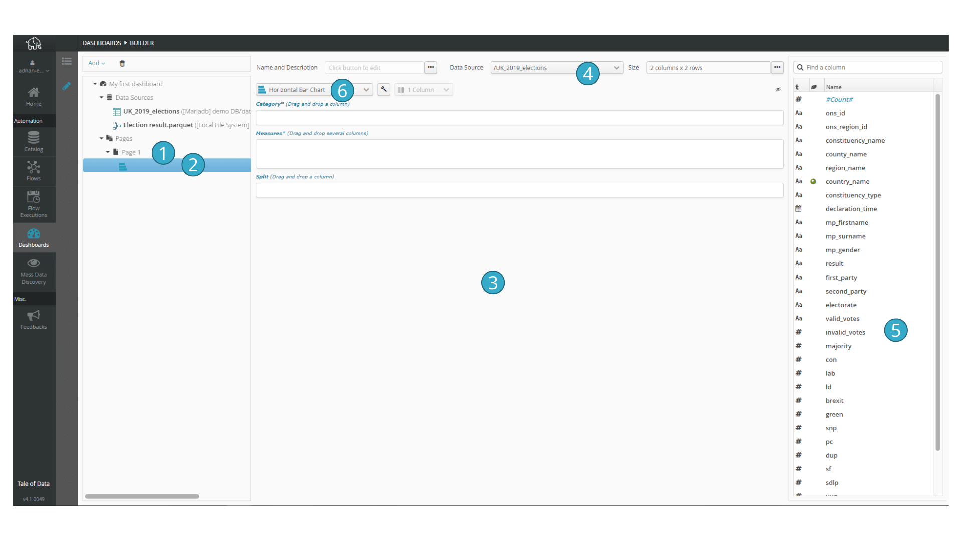
A new chart will be added  but will not yet have a title. You can either specify one or have one automatically created by Tale of Data when the chart has been configured.
The chart is configured in the middle of the screen  .
.
Select a data source  . A list of fields available for this source will appear in the list on the right
  .
.
Now select a chart type  , e.g. a histogram. Other types are detailed further on.
6.2.3. Configuring a histogram
Put your data into buckets : easy histograms
Discover the histogram transformation in the preparation editor, allowing you to make your buckets without breaking a sweat ! And then run the flow again with nothing more to be done.
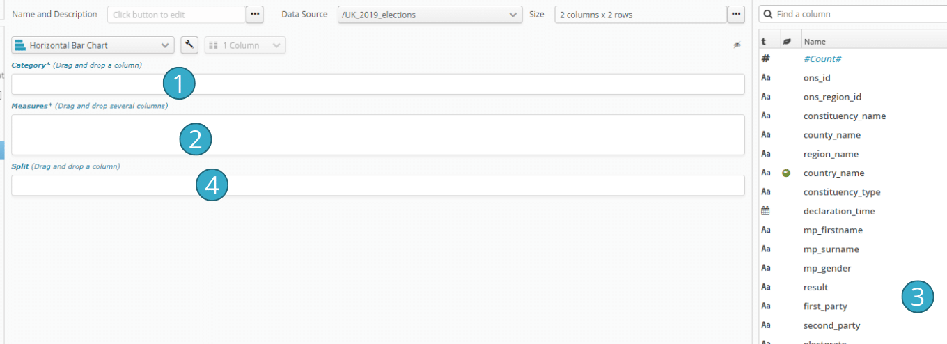
- A histogram has two basic parameters:
To select what is to be included in category and measurement(s), choose an interesting field from the list of fields  and drag and drop it into the rectangle
  or
or  you want. While you are dragging and dropping a field, the drop zones compatible with that field will show green.

The copy of the next screen shows an example of a configured histogram.
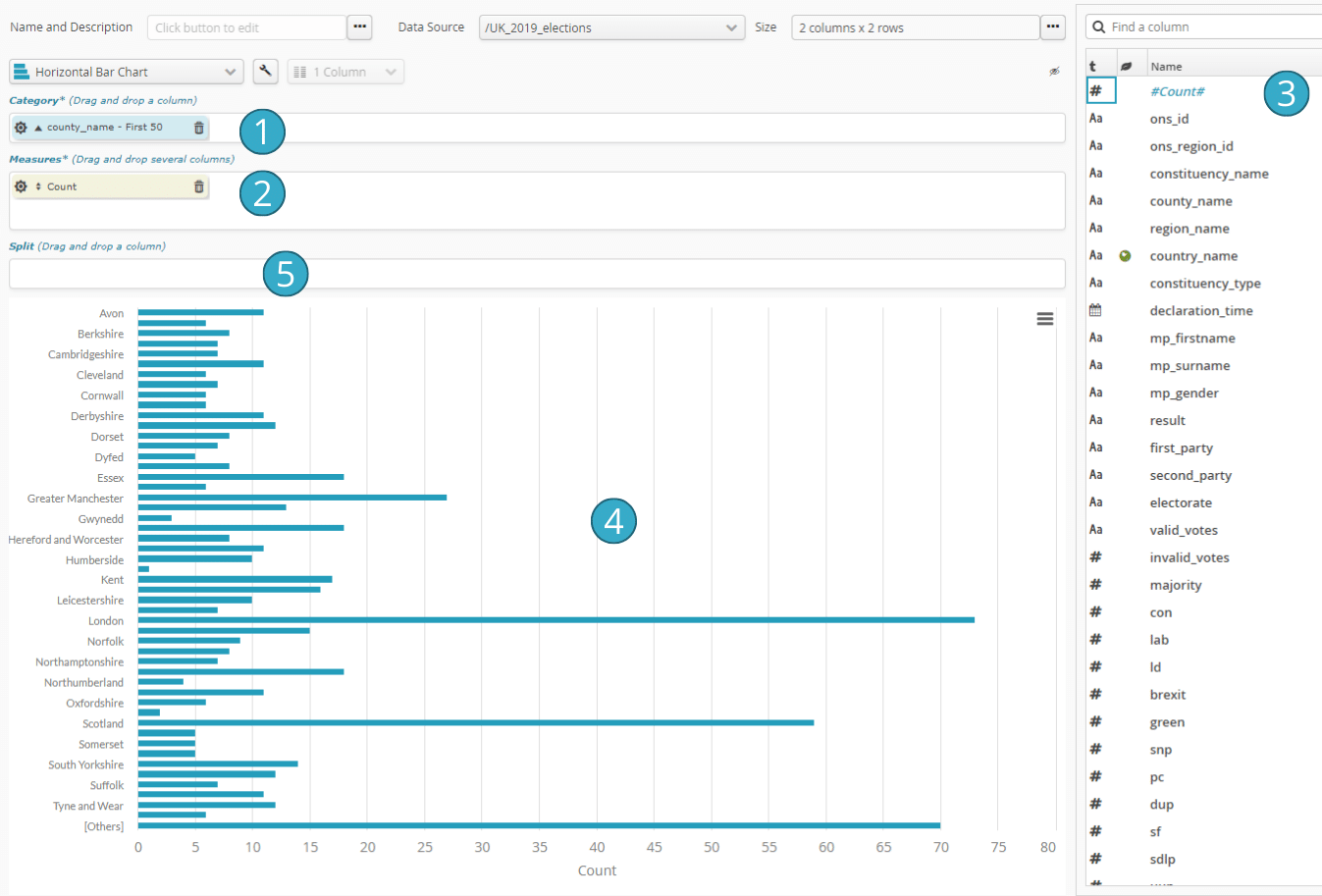
In the configuration we have included in  a column with categories for the x-axis. In
  , we have included a rather special field
  that exists for all data sources and always appears in the first position: #Number#.
This field  lets you display the number of rows concerned, which will be measured by the x-axis. We can add more fields to
  . Sets of additional bars will be added.
6.2.4. Important configuration options common to all types of chart
6.2.4.1. “Distribution”
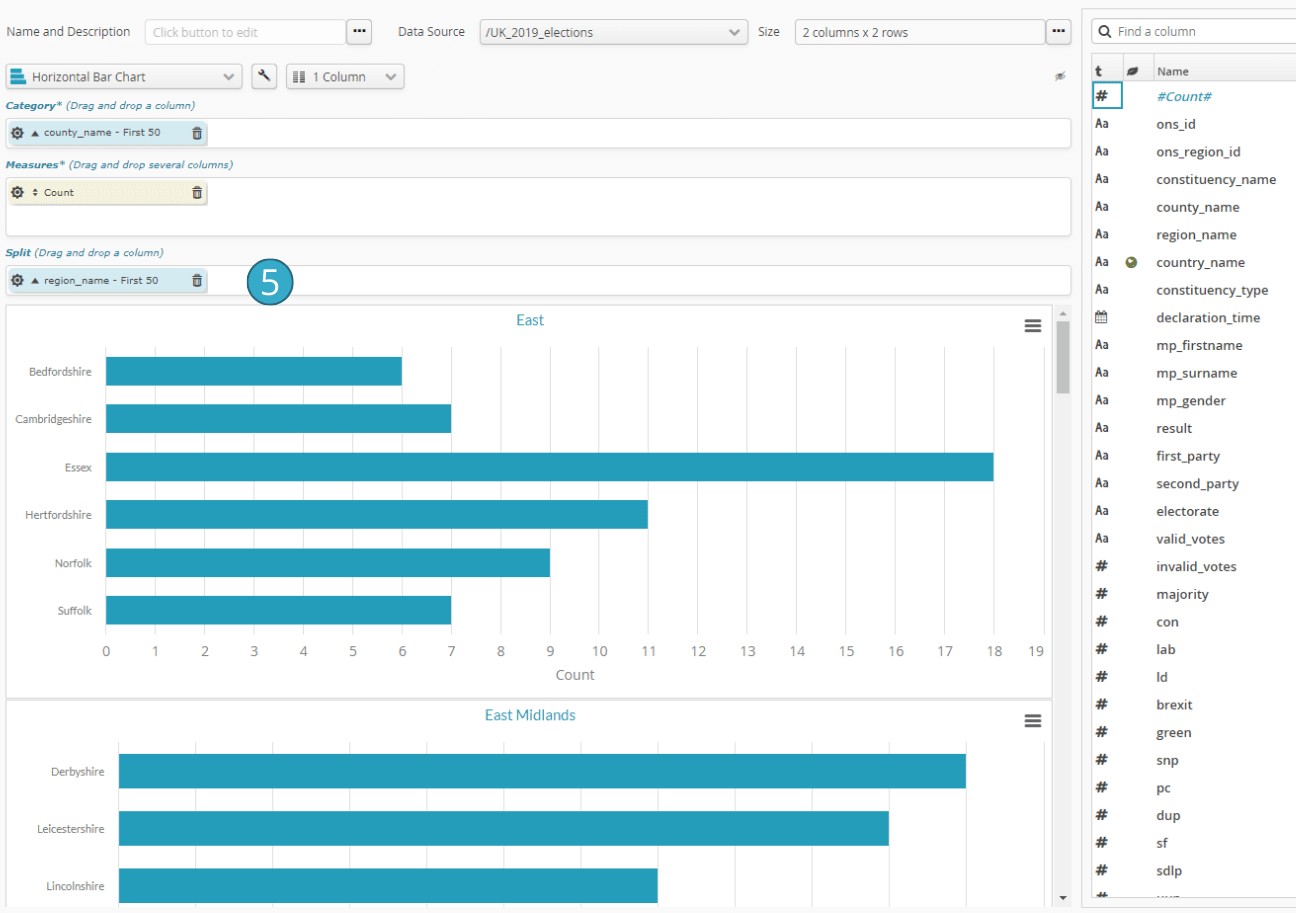
By adding a field in the distribution box  , you can automatically generate a set of charts showing the distribution of values in each category described by the added field
  .
.
6.2.4.2. Chart fine-tuning options
To ensure the chart exactly resembles the sink in question, you often need to fine-tune it by e.g. adjusting the colour scheme or sorting certain axes.
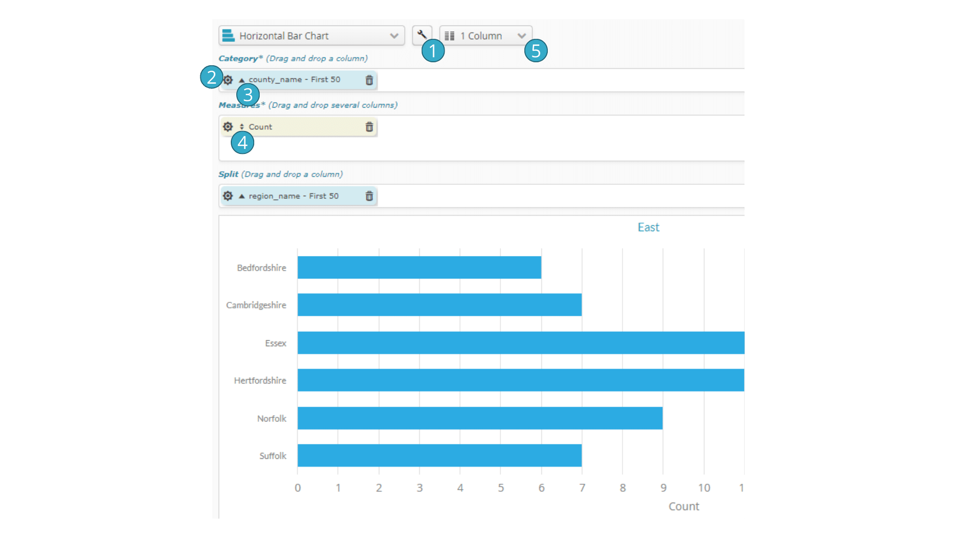
 wrench” for tuning the entire chart
  sprocket” for fine-tuning one aspect of the chart
  little triangle” for configuring aspect sort
  little triangle” when no sort is active (it becomes a double triangle)
  number of columns in which the charts will be displayed if distribution has been configured
6.2.4.2.1. Tuning the entire chart - “the wrench”
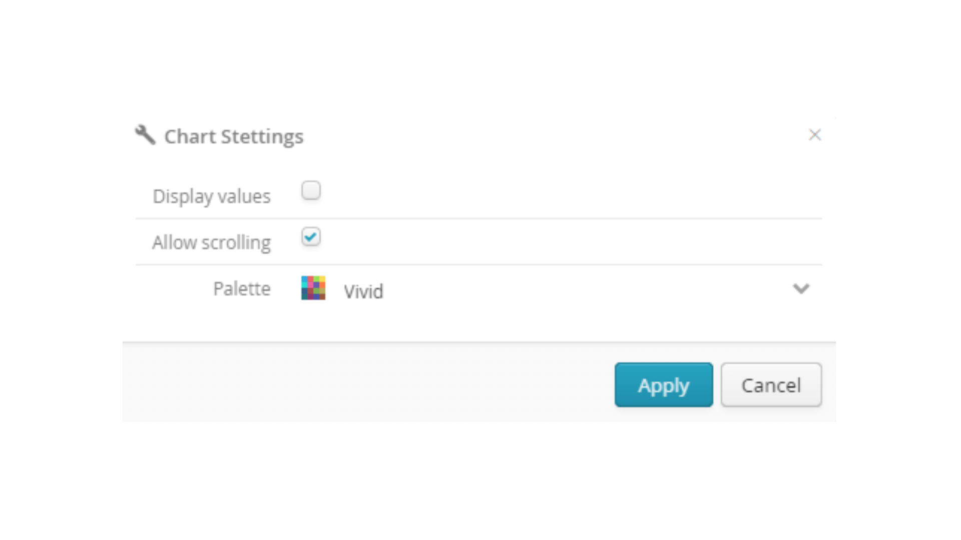
When tuning the entire chart (with the “wrench”) and depending on the type of chart, you can configure:
the text display in the chart of the values for each series
whether the chart can be scrolled, i.e. whether it can be bigger than its frame. Scrolling is very useful in charts with lots of categories, which are typically all bar charts and charts that make comparisons with the average.
the color palette to be used to differentiate between categories or series.
Certain specific behaviors apply to some types of charts:
It is possible to display point labels, for example, on “bubble charts”.
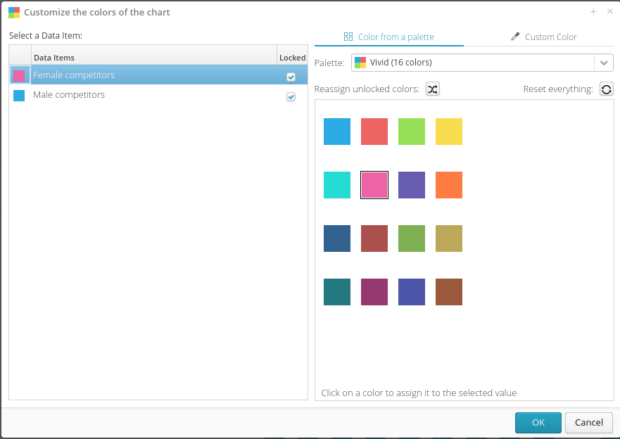
6.2.4.2.2. Tuning the entire chart - Customize the colors of the chart
Color customization using the icon is also available for charts with multiple categories.
6.2.4.2.3. Fine-tuning one of the aspects of a chart - the “sprocket”
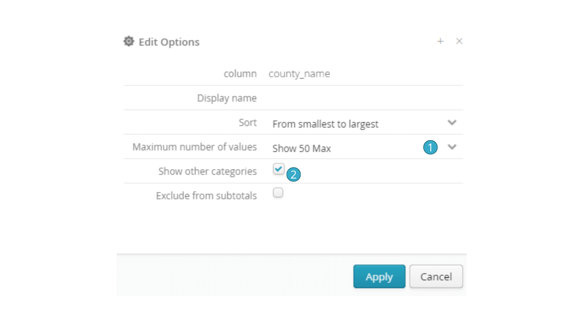
The sprocket for one aspect of a chart lets you:
rename the aspect (i.e. how its name is displayed in the chart) if the name automatically given to it is inappropriate
configure how numeric or date values are/are not grouped together
The option  to limit the max number of values is about the max number of categories there can be if interval grouping has been selected. This parameter combines with
  to determine whether an Other category should be left. If you do not want to have an Other category that presents by default, untick the box
  for this aspect in the chart concerned.
6.2.4.2.4. Aspect sorting
To adjust a sort, click the “little triangle” for the series concerned. Click as many times as needed to change status from “sort ascending” (triangle pointing up) to “sort descending” (triangle pointing down) or “no sorting” (double triangle) before returning to “sort ascending” with the next click.
You may need to coordinate the sort across several different aspects before you get the result you want.
6.2.4.3. Chart title and description
Don’t forget to click the button with three dots to configure the name and description of the chart. Like page and overall dashboard descriptions, chart descriptions can include rich formatting with, for example, variations for policies, character size and text color. A properly explained chart will save the users of your dashboards precious time and clarify assumptions, calculation methods, data origins, etc. Data storytelling will make your dashboards much smoother running and easier to use.
6.2.5. Dashboard refresh settings
Regarding the refresh of the source data for charts, three behaviors are possible:
If the data source has been added directly to the chart by referencing a table in the catalog: the data expires after 2 minutes and is reloaded upon each view if it has expired.
If the data source has been added from a flow, by clicking on the “Add to a dashboard” button in the configuration panel of the relevant target: the data is reloaded each time the execution of the corresponding flow is completed. Otherwise, it will never be reloaded.
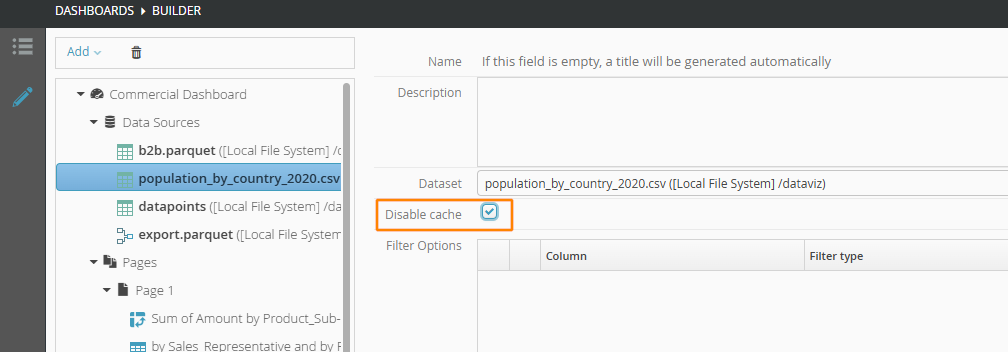
If the “Disable cache” checkbox is selected, the data will be reloaded every time a chart consuming it is viewed.
6.2.1.1. How to create a dashboard
Go to Dashboards and then click
  New dashboard.
In the window that opens, enter at least the name of the dashboard. You can specify a group (as for flows) and add a description with formatted text.
Descriptions are an important aspect of dashboards. They let you document the dashboards, their pages and their charts richly and in detail so that they can remind users about their subjects (e.g. data calculation methods and data origin).
On the left of the view that appears is a tree presenting the essential aspects of the dashboard, while on the right is a box for configuring the item selected.
Essential items include a list of dashboard data sources,
  a list of dashboard pages, and
  a list of any charts that belong to the page in question.