6.3.9. Table
The table chart lets you represent certain columns from a table in a board. The end user of the dashboard can Filter data, sort columns, and download the table in Excel format independently..
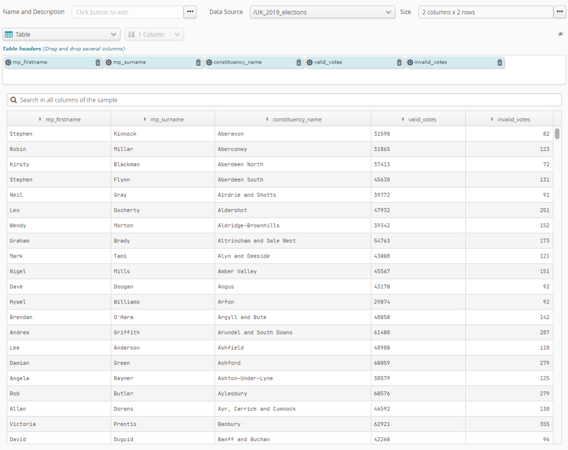
To select the columns that will be represented, simply add the Table header, field in the order you wish. You can then, if necessary, rearrange the fields using drag and drop.
The user will first see the sort order set by the table designer but if the user wishes to change that order, the new order will take precedence over the designer’s original order.
Use the sprocket for the field concerned to change its organization into categories. This may, for example, let you change:
the interval size of numeric values.
the organization mode for date-type values, by e.g. month, year, century, etc.
the number of categories represented (10, 20, 50, etc., or all of them).
if there are too many categories to be represented, whether an “Other” category should be included.
Pour les champs numériques utilisés pour la mesure, la roue dentée du champ de la mesure permet de paramétrer le mode de mesure. Ceci permet de choisir, à partir de ce champ numérique, ce qu’il faut calculer. Les calculs disponibles sont :
number of items (Number)
item average (Average)
sum of items (Sum)
smallest item (Minimum)
biggest item (Maximum)