6.3.15. Map
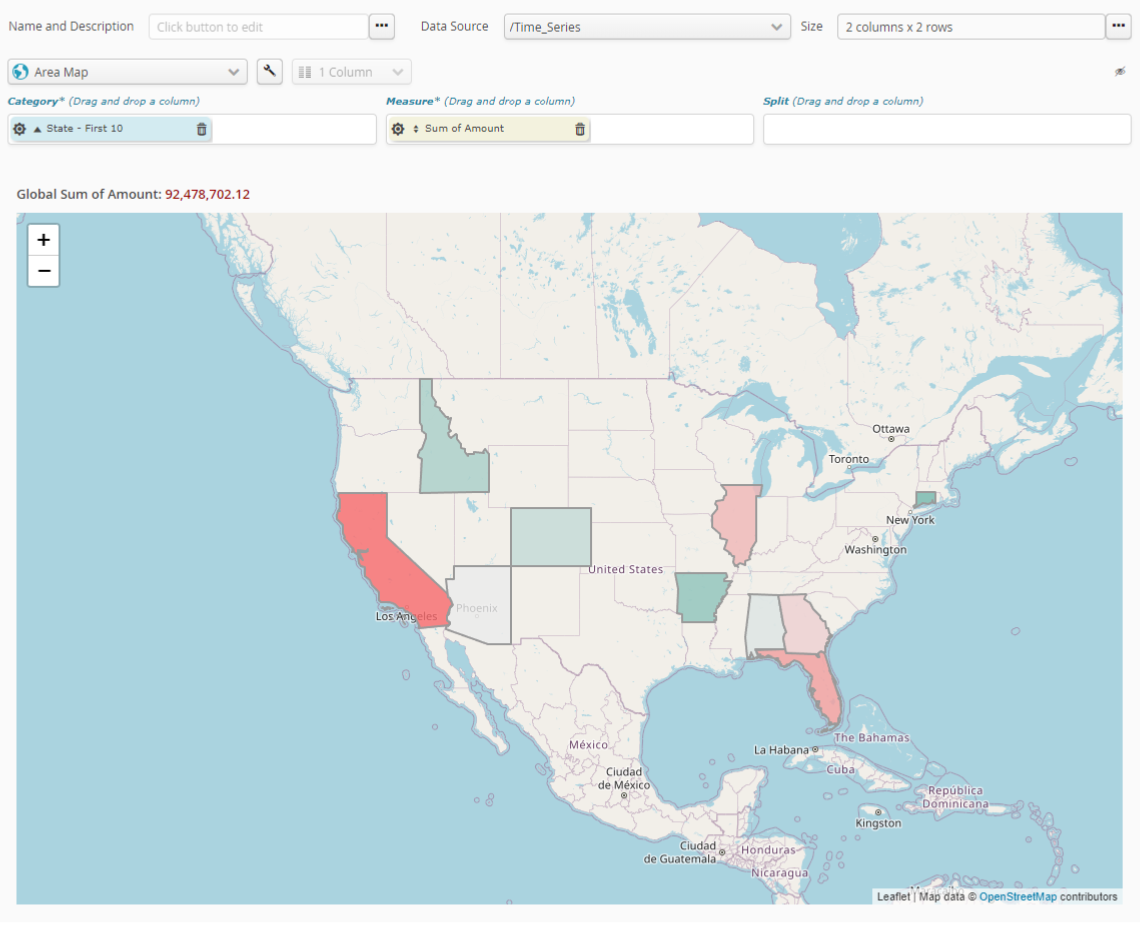
Map* charts let you represent data in geographic zones.

To ensure the chart works correctly, your data must present at least one column that Tale of Data recognizes as designating geographic zones.
In the case of the numeric fields used in the measurement, the sprocket for the measurement field will let you configure measurement mode. This will let you select what needs to be calculated, based on that numeric field. Available calculations are:
number of items (Number)
item average (Average)
sum of items (Sum)
smallest item (Minimum)
biggest item (Maximum)
There are several coloring options:
- No color
No background color.
- Linear gradient
The color will be applied along a range of shades, from the lowest to the highest value. The value that is exactly between the minimum and maximum values will be the color in the middle of the gradient.
- Gradient percentile
The color will be applied along a range of shades that will take account of the distribution of the values concerned, from the lowest to the highest value. The precisely median value (i.e the value with as many values above it as below it) will therefore be the color in the middle of the gradient.
6.3.16. Points map
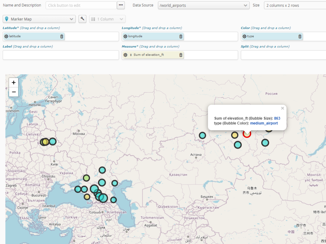
A map chart lets you represent data with latitudes and longitudes:
a numeric value for the X axis (mandatory)
a numeric value for the Y axis (mandatory)
a text value for the color (optional)
a numeric value for tooltip size (optional, called measurement)
a text value for the label (optional)

Use the sprocket for the field concerned to change its organization into categories. This may, for example, let you change:
the interval size of numeric values.
the organization mode for date-type values, by e.g. month, year, century, etc.
the number of categories represented (10, 20, 50, etc., or all of them).
if there are too many categories to be represented, whether an “Other” category should be included.
In the case of the numeric fields used in the measurement, the sprocket for the measurement field will let you configure measurement mode. This will let you select what needs to be calculated, based on that numeric field. Available calculations are:
number of items (Number)
item average (Average)
sum of items (Sum)
smallest item (Minimum)
biggest item (Maximum)
To change tooltip color, Simply use the “wrench” setting key for overall options of the chart..