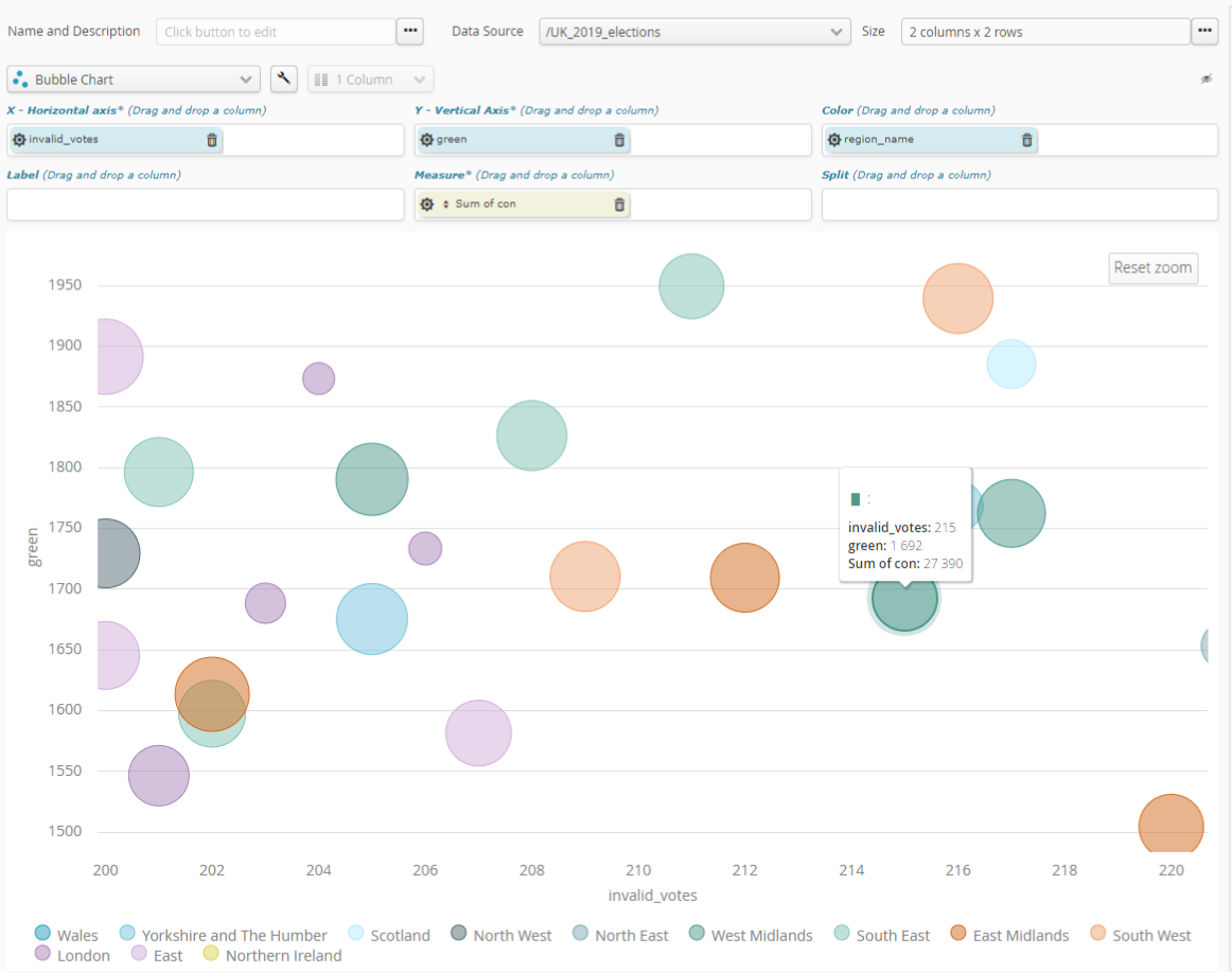
6.3.6. Scatter graph
Scatter graphs represent numeric data in up to five aspects:
a numeric value for the X axis (mandatory)
a numeric value for the Y axis (mandatory)
a text value for the color (optional)
a numeric value for tooltip size (optional, called measurement)
a text value for the label (optional)

To change tooltip color, Simply use the “wrench” setting key for overall options of the chart..
Use the sprocket for the field concerned to change its organization into categories. This may, for example, let you change:
the interval size of numeric values.
the organization mode for date-type values, by e.g. month, year, century, etc.
the number of categories represented (10, 20, 50, etc., or all of them).
if there are too many categories to be represented, whether an “Other” category should be included.
In the case of the numeric fields used in the measurement, the sprocket for the measurement field will let you configure measurement mode. This will let you select what needs to be calculated, based on that numeric field. Available calculations are:
number of items (Number)
item average (Average)
sum of items (Sum)
smallest item (Minimum)
biggest item (Maximum)