7.4. Visualization
With Tale of Data you can create all sorts of chart just using drag and drop.
Caution
The charts let you view just the sample data you are manipulating in your flow, making it easier to identify quality problems in the data. Although sample size can be increased by adjusting the Record limit setting for flow source nodes, the functionality was not originally designed to allow data to be viewed across all datasets.
Tip
You can continue using the Filters and Facets tab in Visualization to filter new charts immediately they have been created.

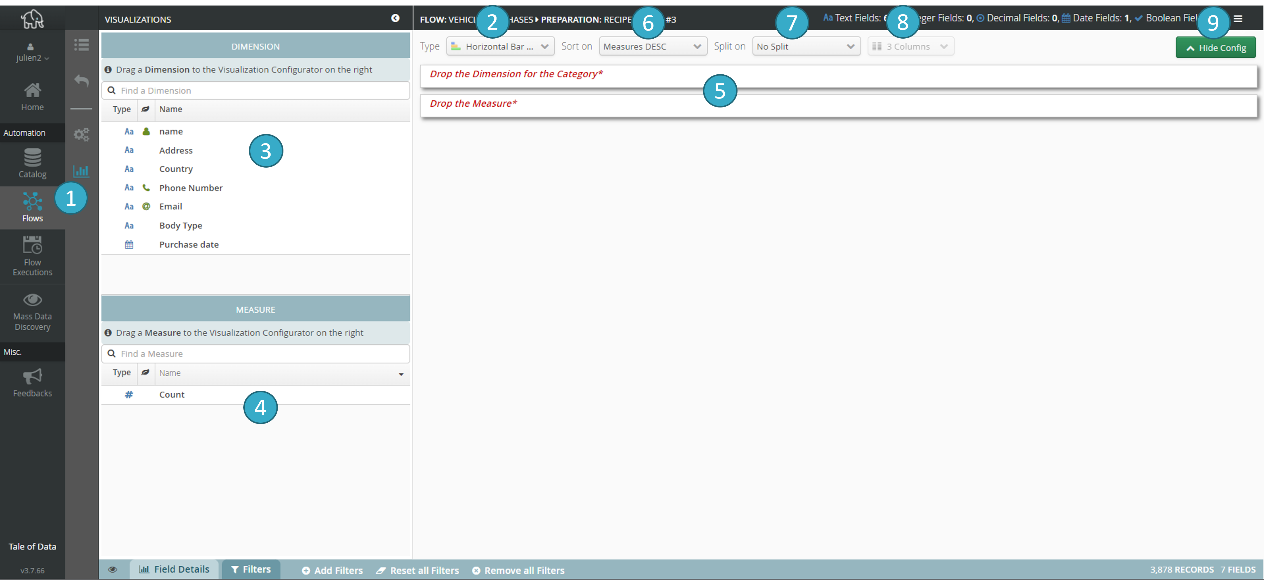
Selection of the type of chart
 you want to create (vertical/ horizontal bar, pie, donut, grouped vertical/horizontal bar, data table, map). Depending on the type of chart selected, the zone
  will show 2 or 3 drop areas (drag and drop).
Zone listing the dimensions[5] available
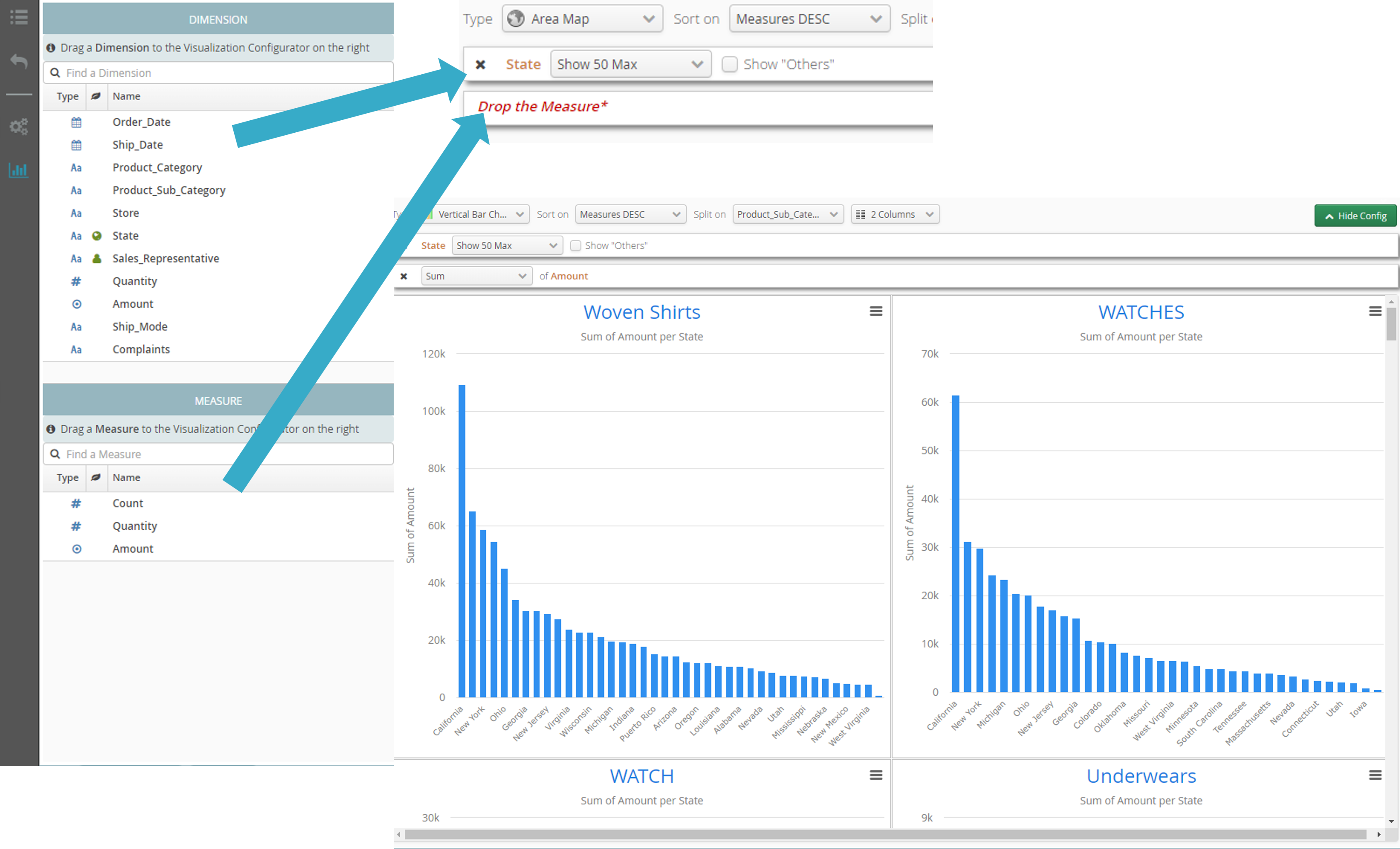
 . Drag and drop a dimension to the first area (called Déposer la dimension pour la catégorie) in the drop zone (= zone
  ). If the drop zone contains an area called Déposer la dimension pour la sous-catégorie, make a second drag and drop of another dimension to that area.
Zone listing available measurements[6]
 . Drag and drop a measurement to the last area in the drop zone (called Drop the measurement).
When all the areas in the drop zone have been filled (= zone
 ), your view will display.
Report/chart sorting
 by measurement (ascending/descending) or category (ascending/descending).
Exploded view
 (split) of the report/chart into several sub-reports, obtained by selecting a split dimension.
You can select the number of columns
 to be filled with sub-reports after you have exploded your report/chart..

You can select the max number of different values
 you want to display for a dimension. This functionality is generally used together with sorting of measurements. For example, the figure above shows how to display for each sub-report just the 5 US states that have the highest sales (amount).
Click here to export
 the chart to vector or image format (so that you can e.g. include it in a presentation).
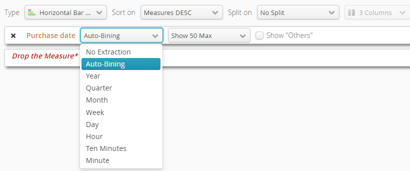
By dragging and dropping a date as the dimension of a report, you automatically discretize the dates (auto-binning).
You can also select an interval (year, quarter, month, week, day, hour or even minute):

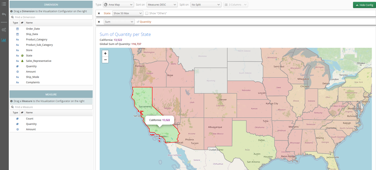
Automatic geographic place recognition lets you create maps using the same drag and drop method:

Automatic geographic zone recognition 
Note
The standard version of Tale of Data is delivered with a limited number of geographic zones (North America + part of Western Europe). Please contact us if you want wider coverage.
